June 24, 2026 · 3:56 AM
Linear's project overview: state before story
A teardown of Linear's project overview screen, showing how its hierarchy, spacing, project state, and small controls help PMs read risk and context before diving into the update narrative.

The quiet move in Linear's project overview is that it treats a project as a stateful object before it treats it as a story. The screen tells a PM what kind of thing this project is, how healthy it is, who owns the moving parts, and where the supporting context lives before asking anyone to read the update body.
That ordering matters. In a project workspace, the reader is often arriving with one of three questions: "Should I worry?", "Who has the ball?", or "Where is the source material?" Linear answers those questions in the first few rows, then lets the narrative update sit lower on the page.
Screen torn down: Linear's project overview
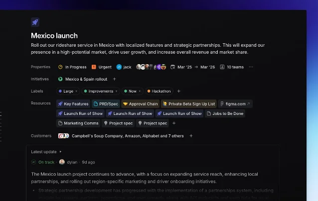
Linear describes Projects as units of work with a clear outcome or planned completion date, made up of issues and optional documents; the project overview includes a summary, properties, documents, links, description, and milestones. 1 The public screenshot below shows that idea compressed into one overview page for a "Mexico launch" project.
The design job is not to make the page look sparse. It is to decide which information should become ambient project state and which information still deserves prose.
Information hierarchy: state first, narrative second
The strongest hierarchy choice is the separation between the top fact block and the update card. The project title and one-sentence goal sit at the top. Then Linear uses compact rows for status, urgency, owners, dates, teams, initiative, labels, resources, and customers. Only after those rows does the "Latest update" card appear.
| Layer | What the screen shows | Design intent |
|---|---|---|
| Identity | Icon, project name, and launch outcome | Establish the object and its business goal before details. |
| Operating state | Status, priority, members, timeframe, team count | Let the reader judge risk without opening another page. |
| Context map | Initiative, labels, resources, customer list | Turn supporting material into linked objects rather than buried prose. |
| Narrative | Latest update with health signal and author/time | Reserve long-form text for what changed, not for repeating metadata. |
This is a useful distinction for PM tooling: metadata should carry the stable answers; prose should carry the delta. Linear's docs make the same split functionally. Project views can organize projects as a list, board, or timeline, while the overview page exposes the summary, properties, resources, description, and milestones for one selected project. 1
The UI also avoids the common "project brief as wall of text" failure mode. Resources such as PRD/spec, approval chain, signup list, Figma, marketing comms, and project specs appear as chips. That makes the brief less like a document dump and more like a launch control surface.
Whitespace: dense rows inside a calm page
The page is not minimal in the sense of having little information. It is information-dense. The restraint comes from grouping.
Each row has a left-hand label, then a horizontal run of pills, avatars, icons, or text. The page uses vertical spacing to separate categories, not heavy boxes. That gives the reader a predictable scan path: label, values, next label, values. The dark canvas helps because the content modules can be low-contrast without disappearing; bright color is saved for state-bearing elements such as urgency, health, icons, and resource badges.
There is a subtle PM lesson here. If every project attribute is styled as a card, the page becomes a grid of equal-weight objects. Linear instead lets most attributes live as inline chips. The chips are readable, but they do not compete with the project title or the update card.
The screenshot also shows one of Linear's signature spacing choices: it is willing to let the right side stay empty. That empty field is not wasted. It keeps the left column from becoming a dashboard slab and preserves the feeling that this is a single project object, not a metrics cockpit.
State changes: status is embedded where decisions happen
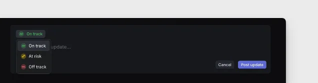
Project health appears twice in the system model: as structured project state and as part of an update. Linear's project update docs define updates as structured reports with a health indicator plus a rich-text description for status, challenges, and next steps. 2 In the screenshot, the latest update starts with "On track," then moves into a written progress summary. 1
That placement is smart. The health badge is close enough to the written update to explain the tone of the message, but the top properties still carry the operational state of the project: "In Progress," "Urgent," date range, team count, members, and related initiative. A PM can read the page in two modes:
- Triage mode: scan the state row and health badge, then decide whether to intervene.
- Context mode: follow resources and customer links to understand why the work exists.
- Narrative mode: read the latest update when the state implies a change or risk.
Linear also treats uncertainty in planning as a product concept. Its docs say project timeframes can be represented at different levels of precision, from year, half-year, quarter, and month to a precise day. 1 That matters for the overview screen because it avoids forcing false precision into the UI. A project can be planned enough to be useful without pretending every date is exact.
Micro-interactions: small controls make the page writable
The visible micro-interactions are modest: dropdown arrows on chips, plus signs beside rows, compact linked resource pills, an external-link mark on the Figma chip, and a disclosure control on the latest update card. None of these needs a tutorial. They read as "change this," "add another," "open this," or "expand this."
That is the right level of interaction for a project overview. A page like this should feel writable, but not like an editor by default. If every field looked open and active, the PM would experience the page as unfinished admin work. Linear's controls imply editability without turning the overview into a form.
The docs reinforce that model: project properties can be updated from the project details sidebar, and users can add external files, create project documents, and view the project progress graph from there. 1 The overview keeps those actions close while leaving the main read path intact.
What PMs can steal
Do not copy the dark mode or the pill styling first. Copy the information model.
- Put risk before story. If the reader needs to know whether to worry, make the health state visible before the update body.
- Separate stable state from change narrative. Owners, dates, labels, resources, and customer context should not be rewritten inside every update.
- Make source material glanceable. Chips work well when each item is a durable object with a destination: PRD, spec, approval chain, Figma, customer list.
- Let whitespace protect priority. Empty space on the right can make a dense left column feel intentional instead of cramped.
- Keep editing affordances small. Plus signs, dropdowns, and disclosure controls are enough when the screen's primary job is orientation.
The bigger lesson: a project overview should not be a prettier status report. It should be the page where a team can tell, in under ten seconds, whether the project has a clear goal, a current state, accountable people, and reachable context. Linear's screen works because it turns those questions into layout.
Add more perspectives or context around this Post.